
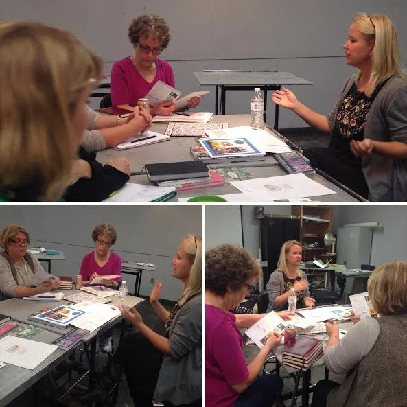
The last couple of semesters, my art licensing students have had the pleasure of talking with professionals in the Illustration and Licensing world including Jennifer Nelson, Jennifer Orkin Lewis (August Wren), and most recently Sabryna Fahrney from C.R. Gibson. Sabryna (formerly Sabryna Lugge) has been a senior designer at CRG for several years and is only moving up in the art department! She not only talked about creating artwork and products for customers as an in-house designer, but also how she looks for trends, what it's like to help buy/license art for a company, and what promotional materials from freelancers catch her eye the most.
Just like many artists out there, Sabryna has to work with an art director and a client. It may mean creating a new product line for a top account or utilizing the hottest trend for the next season. Here are some of the tips she gave during her visit, which I think are gold!
Be flexible, and don't take feedback personally.
Many times a company will need changes to artwork. It has nothing to do with whether your art is "good" or "bad" (hey, if they're working with you, they already like your stuff). However, maybe your hot pink background isn't trending in a particular piece and they're hoping you can use robin-egg blue instead. Companies need changes for all sorts of reasons- manufacturing concerns, what the customer wants, product dimensions...don't take it personally!
When trend shopping, look at all products.
I love how Sabryna told my students to trend shop in ALL sections of a store. You'll notice colors or trends in the gardening section pop up in the furniture or bath aisle as well. This gives artists a broad scope of inspiration and industry knowledge. It also gives you the chance to explore a trend that is in one category, like apparel, before it hits another category such as greeting cards.
Make the most out of your promotional materials.
Sabryna brought some of her favorite promotional materials and portfolios that artists sent in along with examples of some that could be improved. This was a great opportunity for my students to see real-life examples of art samples and understand the finer points of promoting themselves.
Some great tips from Sabryna include:
1) Make sure your name and contact info is on every separate page of a PDF file or printed portfolio. SERIOUSLY. I remember reviewing art when I was at C.R. Gisbon, and things get pulled apart, ripped out, and after an hour long Christmas meeting, someone picks up an art sample only to say "anyone know which artist did this?". Sometimes we're talking about hundreds of individual sheets of paper scattered on a desk, so you want to make sure your name is on everything.
2) Think about the design of your promotional materials. Many artists focus on the art, only to let the design of their samples fall flat (and bring down the overall impact of your submission). What does this mean? Make sure your font choices are appropriate (don't pick fonts that are distracting, too big, an obnoxious color, etc). Logos should be visible but not compete with the art. Don't put distracting borders or background colors around your art (we looked at one portfolio that had thumbnails on black pages- it was amazing to see how that one decision sucked the color out of the art samples). The ones that worked best were clean and simple, with the art being the hero.
3) Try to show more than one piece of art or collection. Sabryna mentioned that seeing one collection or pattern may not be enough to get her to reach out to a new artist. When designing your promotional pieces that will be mailed, consider different ways to show a few good pieces all at once. One oversized mailer we looked at had one BIG image on the front, with 6 thumbnails on the back. This was a great way for the artist to get full impact out of their art while showing a sneak peek of other great designs they had available. In this way, Sabryna and her co-workers could tell this artist was not a one-hit wonder. Other ideas include making more than one mailer and sending them together (like a mini portfolio) , or finding a way to present more than one portfolio piece on a postcard (find a couple of designs that compliment- and not fight- each other). Of course, emailing a PDF file or jpegs is common and many companies enjoy seeing submissions in this way, too. Sabryna and I agree that even in the digital world, it's fun to get actual mail. Emailing art samples doesn't guarantee an art director will print out and save your portfolio, whereas they may keep a mailer just because they are fun to collect and brighten up an office. Make sure to shake up your promotional tactics once in a while. If online submissions aren't working, send something special in the mail. Postcards letting you down? Try submitting your work to an online blog such as Print & Pattern or They Draw & Cook for a different kind of boost to your marketing plan.
HUGE thanks to Sabryna for visiting my class! I hope she had some ideas that helped you out, too. Thanks for reading!